Granular maps of where the FHA Loans (and delinquent ones) are located
Granular to the census tract
This post contains national heat maps for where the FHA loans, delinquent FHA loans and seriously delinquent FHA loans are located. The maps are granular to the census tract level. There are about 85,000 census tracts with populations ranging from 1,000 to 15,000 or so with an average around 4,000 folks in each. In other words, these maps are quite granular, even more than zip code, so they provide good look at what neighborhoods within metro areas the FHA loans (and delinquent/seriously delinquent loans) are concentrated.
There are 3 ~50mb zip files linked to the end of this post All, DLQ, and SDLQ. Unzip them and open the index html file and the maps will open in your browser (recommend Edge) allowing you to zoom in and evaluate any individual census track in the country (except for Connecticut which changed all their census tracks last year and I have yet to map those changes but will in later versions of these files)
For each track I provide the following information
How many FHA mortgages of whatever the map type is (All, Delinquent (1+ month late), Seriously Delinquent (3+ month late)) that are active mortgages as of the May FHA GNMA_II MBS data that I can link to the HMDA origination record
The number of FHA mortgages in the census track when I scale the linked number to the full FHA portfolio size of 7.9 million assuming the mortgages I cannot link to HMDA distribute in the same proportion to the census tracks that the linked ones do. (the state distributions of mortgages I can and cannot map track very closely so while the scaled projections definitely wont be exact, they should paint a good picture)
The number of housing units for the census track from both the baseline 2020 Census Current Address Count Listing Files and the most recent January 2025 release of that data. I use this data to project 2020→2025 housing growth in the census tract.
The number of one to four unit homes in the census track as reported with the recent HMDA data which reflects the baseline 2020 census data
My projection of the 2025 number of one to four unit homes in the census track. For most census tracts this is the 2020 baseline HMDA number multiplied by the growth in housing units from the current address count listing files. Occasionally when the data between the address count data and HMDA single family homes data massively varies. I adjust the number to what is more reasonable for the population of the tract.
The population in the tract as of the HMDA data reflecting the baseline 2020 census data
The percent of FHA mortgages (the scaled number to the portfolio) for all the one to four unit homes in the tract. This is the number that is used to generate the shading in the heat maps
For example the data on all FHA mortgages in Census Tract 126.02 in Barnstable County Massachusetts is shown in the image below. The heat maps are interactive though and you can click on whatever census tracts you may be interested in to see the information, with the more interesting ones shaded more heavily
The full portfolio, delinquent portfolio, and seriously delinquent portfolio are just the first in a series of heat maps I will be generating from the underlying data each month. Going forward I will create similar style maps for FHA loans with partial claims, the FHA modifications of Doom, and more granular delinquency maps that show the current to one month late transitions, one to two month late transitions, mortgages with student loans etc.
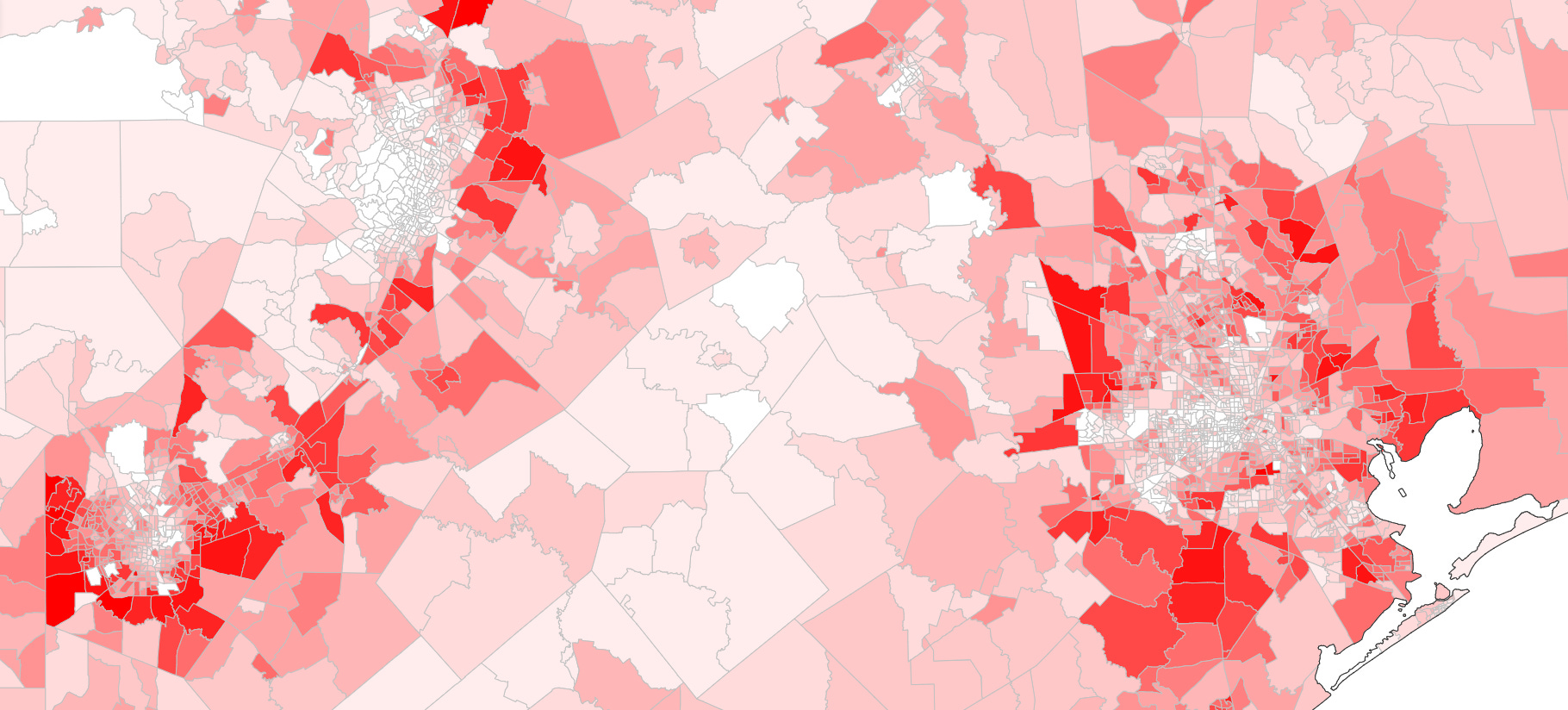
One interesting insight that becomes apparent when looking at these maps is that the FHAs by and large are not located in city cores but rather on the outskirts. This image (from the ALL heat map) of Houston, San Antonio and Austin shows this phenomenon. This makes sense when you think about it since home prices tend to fall the further away from a city core you get. New construction is also concentrated to these peripheries. With first time homebuyers and buyers of new construction such large cohorts of FHA lending, this periphery effect tracks.
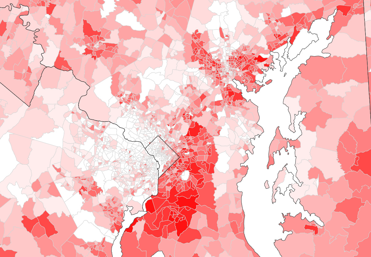
Delinquency and serious delinquency prevalence (as a percentage of single family homes in the tract) naturally track the concentration of FHA mortgages though when you compare the ALL view versus the delinquent and seriously delinquent view, further tract concentrations of delinquency/serious delinquency The following three images showing the DC area illustrate this. The first image is All the FHA loans, the second is delinquent FHA loans and third is seriously delinquent FHA loans.
The heat map shadings are generated using the Jenks Natural Breaks method with 15 shade bands. This is how it works:
Pricing Update
Effective immediately, the price of the monthly subscription will be $25 a month to create value for annually committed subscribers. The annual subscription will remain at $240 a year.


